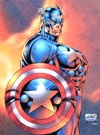
I’ve been following comic books for over thirty years now, so I’ve seen my share of ridiculous story lines, trends, and characters over the last three decades.
However the most, mind-boggling, head-scratching fad was the popularity of Rob Liefield’s (and Todd McFarlane) art in the 1990s.
A couple decades ago, Liefeld, and McFarlane, were not only a popular artists, but they were treated like legitimate comic industry royalty… for some reason. Stories and writers weren’t even in the backseat, they weren’t even in the same car as illustrators were in the 1990s.
Artists were rockstars at Marvel comics. So much that I actually know what Liefeld and McFarlane look like in real life because they were featured in so many comic-related magazines (The two would spearhead a Marvel exodus of high profile illustrators to create their own comic company – IMAGE COMICS).
Yet, I never “got” why Liefeld was so successful. I was completely turned off by his art and considered it much less polished (read: sloppy) in comparison to other less-ballyhooed, but better artists such as Jim Lee and Marc Silvestri.
Reading the comments from a recent piece on 1o9 “What’s The Most Absurd Thing To Come Out Of 1990s Superhero Comics?” — I realized that I wasn’t the only one that hated on the Liefeld bandwagon in the 90s. The commenters made fun of Liefeld for the way he drew feet, his small noses, way-out-of-whack proportions, and inability to draw objects in space.
There wasn’t one thing that stood out of Liefeld’s terrible artwork that was my pet-peeve, it was his overall approach and style. I’m not an artist, but I’ve flipped through enough comic books to know what I like, and what quality artwork looks like — Rob Liefeld is like the singer that over sings to make up for their shortcomings, whereas a true artist knows to display their talent with restraint.

Totally overcompensating. No restraint. UGH. The worst.
.


