Considering how far we’ve come with big data, algorithms, and A.I., you would assume that creating a To Do List app would be easy.
Yet despite the existence of hundreds of apps attempting to recreate a simple checklist of tasks — they’ve each come up short in recreating the to do list’s simplicity on our mobile phones.
Most of the apps I tried didn’t last longer than a couple days (Remember the Milk, Do.com, Wunderlist). AnyDo came close, but ultimately I stopped using the app after a few weeks.
When Google Keep was released a few months ago, I didn’t think much of it because of all of my previous disappointing experiences. I only recently downloaded Google Keep onto my phone after reading this article.
After trying all the previous note apps, you know what’s going to work for you immediately. From the get go, Google Keep felt right.
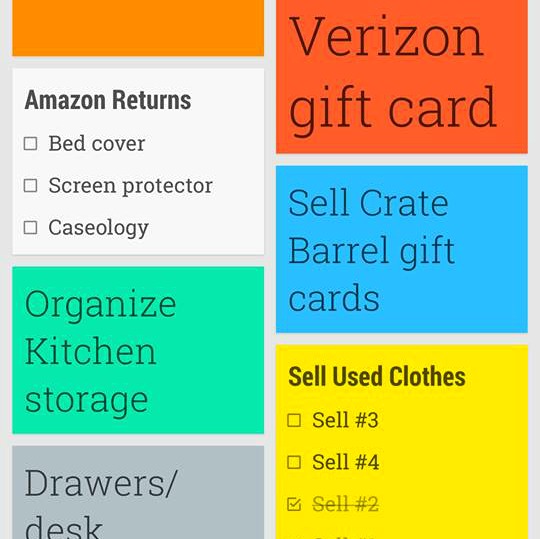
There’s not much else to the app than what you see on the screen: Keep’s interface displays notes, lists and photos as individual boxes in multiple columns – three columns on desktop and two columns on mobile.
Each square can be color coded and the size of the text inside each box depends on how many characters that note has. In the end, your screen is filled with colorful squares of varied sizes — not unlike what you’d see on the Microsoft Surface home screen.
No one wants a complicated to do list, but finding a solution that was equal parts simple, intuitive and beautiful proved to be elusive. All three can be found in Google Keep’s playful and light design.


